The purpose of this page is to give the reader more information about color space. CdCC has obtained
permission to reproduce two web pages found elsewhere on the Internet. We did not author any of the material
and all of the credit belongs to the authors, who are named at the top of their articles. The only role played
by CdCC was to find these two articles and present them here as educational material created by others. We
did modify the presentation formats somewhat to achieve a common look and feel with other CdCC web site pages.
CdCC urges you to read both articles as they may have divergent viewpoints. We
believe that by reading both articles, you will gain a better understanding of color space. CdCC does not
suggest or recommend one article in preference to the other; we believe both have valid information.
Article 1 is Jim Seaman's Photographic Color Spaces sRGB vs Adobe RGB
Article 2 is Michael Reichmann's Understanding ProPhoto RGB
Photographic Color Spaces sRGB vs Adobe RGB
The following was written by Jim Seaman and is published here with his permission.
You can view Jim's articles and photography on his
web site.
I recently posted a question regarding photographic color spaces (sRGB vs Adobe RGB) on an Internet discussion board. The answers I got were all over the place and frankly, never really answered my original question. So I decided to do the work and determine the answer myself. Researching on the Internet proved to be a matter of wading through hundreds of rehashed opinions, very few of which were supported by the technical facts that I eventually found.
So, on to the issue at hand which is the better choice of color space - sRGB or aRGB?
There isnt an easy answer to this question and to appreciate the answers, one must first fully understand the issues at hand.
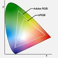
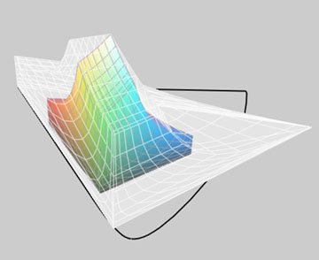
This image shows the relative sizes of the sRGB and Adobe RGB colorspaces within the color universe. The colors shown are not the actual limitations of each colorspace but rather serve to represent the general directions where each colorspace exceeds others.
What is a Color Space?
A rather terse definition is: a model for representing color in terms of measurable values, such as the amount of red, green, and blue in an additive color image. A little explanation of that definition is in order.
Consider all the colors that can be seen by the human eye. This group of colors is called the RGB color space. R standing for red, G standing in for Green and the B representing blue. With these 3 colors, most any shade of color can be reproduced; notable exceptions are the metallic colors.
Ok, weve established that RGB is basically all of the colors, an infinite number of shades, but there are limitations in the ability of cameras, scanners, computer monitors, printers, etc to reproduce all of these colors. This is where sRGB and aRGB (and other color spaces) come into play.
Your computer monitor is not capable of displaying some color shades, likewise your printer cant reproduce some shades. The range of colors that each of these devices can deal with is that devices own color space. The problem with this is that there are thousands of different models of monitors and printers out there, each with their own color spaces. Some sort of standards are required to make the colors of images appear the same over various devices. sRGB and aRGB are two answers to the need for those standards.
What are the sRGB and aRGB Color Spaces?
sRGB is the older of the two and is the Microsoft Windows default. The s stands for standard. sRGB is almost always shorthand for the ANSI designation of: sRGB IEC61966-2.1. sRGB is basically the set of colors that can be seen on the average computer color monitor or color TV.
aRGB was established by the Adobe software company with the a standing for Adobe. aRGB is variously referred to as Adobe RGB, aRGB, Adobe RGB (1998) and SMPTE-240M just to keep everyone as confused as possible. Not all colors in aRGB can be represented on even the top of the line color computer monitors.
Both of these color spaces are subsets of the RGB color space. This means that neither of them contains all the colors visible to the human eye. And this is where the controversy begins.
What are the differences between sRGB and aRGB?
Here we have to get into the way colors are recorded in JPEG images. In JPEG images, there are 24 bits allowed for describing a color. 8 bits are allocated to describe the amount of Red 8 bits for Green 8 bits for Blue. With these 24 bits, 16,777,216 different shades of colors can be described. Up to this point, sRGB and aRGB are identical both describe the same number of colors the difference is in which colors they describe.
The little diagram at the beginning of this article is a simplified graphic representation of the relative sizes of the RGB color space along with the sRGB and aRGB color spaces. In it, you can see that sRGB is a subset of aRGB meaning that the entire range of colors represented by sRGB is included in the aRGB color space. But size isnt everything!
While aRGB can represent colors with more saturated blues and greens than possible using the sRGB color space, sRGB has the edge over aRGB in being able to accurately represent the colors that are within its range. That is because aRGB chooses to represent more different colors while sRGB can represent finer shades of difference in colors (leading to better accuracy).
Remember that both color spaces are limited to 16 million colors, the difference between them is in which 16 million colors they describe.
Should you use sRGB or aRGB?
Sorry, no simple yes/no response here but I will give a broad sweeping generalization: Only 1% of people who take photos will ever print their photos on a device that will reproduce the aRGB gamut of colors in other words sRGB is not just OK, but is preferred for 99% of the photos taken.
sRGB is the only choice for web presentations. sRGB is the standard - aRGB is not an option. Photos that are posted on the web are assumed to be in the sRGB color space and browsers display them that way. If you try to view a photo in the aRGB color space on a web browser its colors will appear washed out. The same is true for email programs (but not email attachements). Conversions can be made from aRGB to sRGB (at a loss in quality) if you need to post an aRGB based photo on the web.
If your camera doesnt give you a choice of which color space to use, as is the case with almost all point-and-shoot cameras, then you can count on sRGB being the default. If you use Wal-Mart, your local drug store, K-mart, Costco, Wolfe Camera, etc for printing your photos sRGB is for you their printers expect and treat all submittals as using the sRGB color space. End of discussion unless these descriptions dont fit you.
Now for that remaining 1 percent of photographers Im going to bet that many of you shouldnt be using aRGB either! First off, if you have not done each of the following, you are shooting yourself in the foot by using aRGB:
- Selected the aRGB color space (or RAW) as the output of your camera
- Calibrated your high-end monitor
- Have a profile for your printer (for each paper type you use)
- Using color space aware editing programs through all steps
Now, even if you meet all the above requirements, you may still be better off using sRGB rather than the Adobe alternative. It is unlikely you will see much difference between the two color spaces because few naturally occurring colors are in the area that is the difference between the sRGB and aRGB spectrums, especially ones that can be displayed with your monitor or home printer.
Still not convinced?
Why not use a working space with the widest gamut possible? It is generally best to use a color space which contains all colors which your final output device can render (printer, web, or your own computer display), but no more. Using a color space with an excessively wide gamut can increase the susceptibility of your image to posterization. If you make large editing moves, youll find that your ability to do so without introducing posterization or color banding is more constrained by a large-gamut space than it is by a small-gamut space.
In the larger color space of aRGB, the limited number of shades that the file has may be spread out over colors that the output device can not reproduce. Thus, the shades will be spread over a larger range of colors that will increase the distance between the shades and the likelihood of posterization.
What about converting between color spaces?
Converting from sRGB to aRGB (or vice versa) is a mathematical operation, and therefore can be a source for interpolation and round-off errors. This is because some computer has to make decisions for you about how to represent colors in one color space that dont exist in the other.
In short, converting from one color space to another causes image degradation, and the larger the differences between the color spaces, the greater the image degradation. An original aRGB or sRGB file is always higher quality than one that was created by converting from the other format. There is very seldom any reason to convert from sRGB to aRGB. You will not gain any greater range of colors. In general, avoid conversions if there is any way to do so!
When should aRGB be used?
If you shoot RAW and convert to 16 bit TIFF, skipping JPEG all the way, then, if you have your editing suite properly profiled, go ahead and use aRGB. You most likely know what you are doing and even if you dont really benefit from using aRGB at least you will not be hurt by using it. Just remember to convert to sRGB for anything that will be displayed on the web or shared via email. Also always verify what color space is expected when sending out files for printing.
There are occasions when aRGB really is the best choice. There is a certain percentage of photographic scenes that contain colors outside the range of the sRGB color space. If you are a professional photographer using a fine art printer that is capable of reproducing these colors and have your computer system properly setup to work with color profiles and you are very experienced with PhotoShop and have a very critical eye for color, then aRGB is likely right for you. Also aRGB is highly recommended when it is required by whoever has contracted for your professional photography services. After all, the art director is always right!
— End of article —
Understanding ProPhoto RGB
The following was written by Michael Reichmann and is published here with his permission.
You can view Michael's other tutorials and forums on his
web site.
A Preferred Working Space for Digital Photographer
Most photographers work under the assumption that Adobe RGB 98 is the most suitable working space within Photoshop. Everyone also knows that the sRGB working space is smaller, and therefore less suitable for professional and fine-art printing applications. Sure, sRGB is fine for amateurs and the web, but real men use Adobe RGB – right?
Well, not really.
One of the most knowledgeable voices in the area of colour management over the last few years has been Bruce Fraser, the co-author of the current definitive work on colour management for photographers – Real World Color Management. In articles that he's written elsewhere Bruce suggests that digital photographers should consider working in the much larger ProPhoto RGB colour space. (ProPhoto RGB was developed by Kodak).
Though I'm familiar with the book and many of Bruce's other writings, and I knew that ProPhoto RGB is a bigger space than Adobe RGB, somehow there wasn't a mental connect – until recently.
What happened was – I had an epiphany. I was preparing for a presentation that I was to deliver to a seminar on colour managed workflow and fine art printing. As part of preparing my Powerpoint slides I wanted to show the difference between the sRGB and Adobe RGB workspaces, so I went into the ColorSync Utility, which is part of the Mac OS. This allows one, among other things, to look at graphic representations of profiles and colour spaces, and compare them.
Figure 1
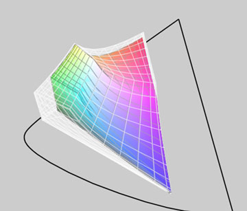
The sRGB color space inside the Adobe RGB color space
For example, in the illustration above in Figure 1 the large ghost diagram shows the Adobe RGB 98 colour space, while the coloured diagram within represents the sRGB space. It's clear from this that the Adobe 98 space is quite a bit bigger, and that especially in the greens and reds/oranges, there is a lot of clipping if sRGB is used.
What does this mean? It means that if your file is in the sRGB space any colours that were in the original image or file will either be clipped or compressed, depending on the rendering intent used. In other words, they're effectively gone.
Now, most photographers know this, more or less, and this is one of the reasons that when shooting in-camera JPGs, if the camera allows one to set Adobe RGB rather than sRGB, this is to be preferred. Why throw away information forever if you don't have to?
Similarly, when working in a raw converter, most photographers know to export their files into Photoshop tagged as Adobe RGB, and of course to have set Adobe RGB as their working colour space.
This all seems very reasonable, and is common practice for most digital photographers. Me included.
So what was my epiphany?
Cameras in Space
Figure 2
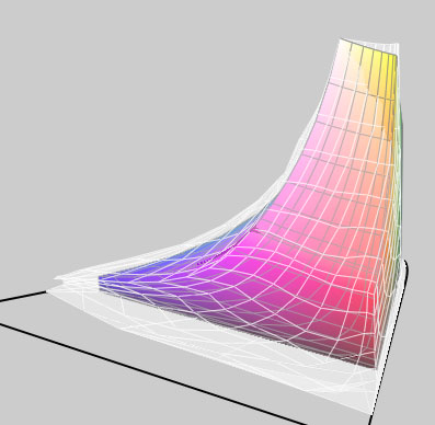
Adobe 98 color space inside Canon 20D generic profile
As I was doing screen captures for my presentation I noticed that a number of camera .ICC profiles were also listed. These had been put into the Colorsync directories by Phase One's Capture One raw conversion software. The profiles are for different lighting conditions, and are supplied for each camera that Capture One supports. They are selected and then tagged to the raw file within the program. Camera Raw within Photoshop does the same thing, except that it does so behind the scenes. It has a daylight and a tungsten profile for each camera that's supported, and these profiles are tagged to the raw file during processing.
Out of curiosity I loaded one of the Capture One camera profiles into the ColorSync viewer. Wow! The colour space was huge! I looked at a number of different camera profiles, and while they were different in many ways, they all were huge. Much bigger than the diagrams that I'd been looking at for sRGB and Adobe RGB.
To see this look at Figure 2 above. The image shows the Canon 20D generic camera profile as a ghost, with the Adobe RGB 98 profile within it. What a difference! The camera's colour space is much much bigger than the Adobe space, especially in the deep reds and blues. Only in the yellows is the camera space smaller than Adobe RGB 98.
What does this mean? Simply, that if you are using the Adobe RGB colour space with a Canon 20D, for example, (and this applies to virtually every other DSLR on the market), you are not getting a lot of the deep saturated colours that the camera's sensor is capable of capturing.
ProPhoto RGB to The Rescue
What to do?
I immediately understood what I had been ignoring for years, even though I had read about it in Bruce's articles and elsewhere. I needed to be working in a bigger colour space, right from the raw processor through to Photoshop.
That's where ProPhoto RGB comes in.
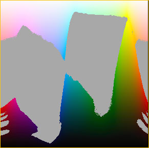
Look at Figure 3 below. At first it shows the camera's colour space as the ghost, with Adobe RGB within it. But when you pass your mouse over it the colour image is of the ProPhoto RGB colour space. As you can see, this is a much, much closer fit. There are a few spots where the camera exceeds even ProPhoto, and a few places where ProPhoto is bigger than the camera's space, but basically it's a decent match. (Notice how ProPhoto now encompasses the yellows that Adobe RGB clips).
Figure 3
Adobe RGB vs Canon 20D Profile
Pass your mouse over the image to see
ProPhoto RGB vs Canon 20D Profile
Below is a more traditional colour gamut chart. The large horseshoe shaped area shows the LAB colour space. This is the extent of human vision. Outside of this area human colour vision comes to an end. The open triangle shows the gamut encompassed by the ProPhoto colour space and the coloured triangle shows that of Adobe RGB.
Figure 4
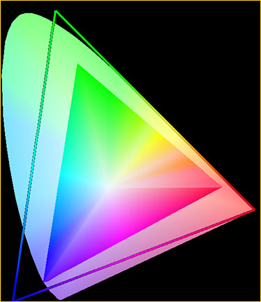
Gamut chart created with ColorThink 2.1.2
Available for both Macs and PCs
What this comparison chart tells us is that while ProPhoto RGB encompasses a great deal more of the visible spectrum, it actually exceeds it in the deep greens and deep blues. What this means is that colours can be pushed into areas which can neither be seen nor reproduced, producing very nasty looking results within the visible spectrum. User beware.
ProPhoto RGB In Use
Using ProPhoto space is easy. In your raw converter, either output your files into Photoshop tagged with the camera's profile if you're using Capture One, or tagged with in the ProPhoto colour space if you're using Camera Raw. (ProPhoto RGB is Camera Raw's native colour space). When using other raw converters it will depend at the converter's capabilities.
You should also set Photoshop so that its working colour space is ProPhoto RGB. When the file comes into Photoshop make sure that if it comes in as ProPhoto RGB it stays that way, and isn't inadvertently converted to a smaller space such as sRGB or Adobe RGB.
Note as well that you must be working in 16 bit mode right through from your raw converter, because in 8-bit mode, with only 256 levels per colour channel, you run the risk of banding (gaps) if you perform large edits.
Is that all there is to it? More gamut providing deeper more saturated colours, and without any cost? Sort of. But, as with most things in life there's a gotcha, and that gotcha is as follows.
Figure 5
17" Powerbook monitor profile vs ProPhoto RGB
Pass your mouse over the image to see
Sony Artisan monitor profile vs ProPhoto RGB
Above in Figure 5, you see the profile for the LCD screen on my 17" Powerbook inside the ghost ProPhoto colour space. Now pass your mouse over it. What you then see is the profile for my Sony Artisan monitor inside the same ProPhoto space. The Sony is bigger, but not that much bigger. (Parenthetically, the Eizo ColorEdge CG220 LCD monitor purportedly encompasses the full Adobe RGB colour space. But it's priced at over US $6,000).
What should be obvious is that if you work in the ProPhoto colour space you have no way of seeing what the colours that you actually have available are, and likely no way or reproducing them. They're not going to disappear altogether,but they will be compressed into your printer's output profile space using the rendering intent that you specify.
So, why bother working in a larger colour space like ProPhoto RGB?
The main reason is the same as why you want to work in 16-bit mode rather than 8-bit mode. It gives you elbow room – room to work with the palette that the sensor has captured, change various aspects of the image to suite your creative needs, and not run into the walls, so to speak.
You'll likely also find that the better inkjet printers and inks are capable of reproducing saturated cyans, magentas and yellows that are outside of the Adobe RGB colour space, making ProPhoto a much better choice. (See Figure 7 below).
But, the price that you pay for having all this freedom is that you're capable of creating what some call "science fiction" colours. These lie outside the gamut of output devices as well as good taste, and they therefore can cause all sorts of problems. So, when working in ProPhoto RGB, or any really large colour space, restraint is the watchword.
Gamut Warning
One way to see the effect if gamut clipping occurs, is to use the Gamut Warning function in Photoshop. It will highlight any out of gamut colours that the image you're working on will have within your current working space or display space.
Here's a good use for the Granger Test Chart which I wrote about recently. If you create two of them, one in the Adobe RBG space and another in the ProPhoto RGB space, you'll see how much less ProPhoto is out of gamut. Figure 6 below illustrates this. The first image shows gamut clipping on Adobe RGB, while the one seen when you pass your mouse over it shows what happens in the ProPhoto space.
Figure 6
Gamut clipping in Adobe RGB
Pass your mouse over the image to see
Gamut clipping in ProPhoto RGB
Note:Adobe RGB is Gamma 2.2 while ProPhoto is 1.8, thus explaing
the different depth
of the black area in the Granger chart
Usage Warning
Figure 7
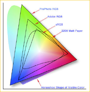
Illustration courtesy Jeff Schewe
fromA Color Managed Workflow
which is found on the Adobe Web site.
In the end, using ProPhoto RGB as your working colour space has many advantages, though a few caveats. The main advantage to my mind is that as technology progresses, and we end of with affordable monitors and LCDs with wider gamut display capability, and as printing inks have wider gamut (Epson's new K3 Ultrachrome inks have a fuller gamut, not a significantly wider gamut), we will have image files that we can return to that can take advantage of these advances, rather than ones that were clipped at birth.
We also have files which will print better, even with today's inks and papers, and which with careful work, can experience greater manipulation without damage, in the same way that 16-bit images can over 8-bit images.
But, on the other hand, an image file in a wide space such as ProPhoto RGB needs to be kept in a cage, so that it doesn't accidentally get into the outside world. Anyone receiving a copy of such a file who doesn't know what they have, and who doesn't function in a properly colour managed workflow, or who presumes that the file is sRGB, can inadvertently use it to produce some really horrid results.
Author's Thanks
Thanks to both Bruce Fraser and Jeff Schewe for their feedback and suggestions in the preparation of this article.
— End of article —